

 Change Image
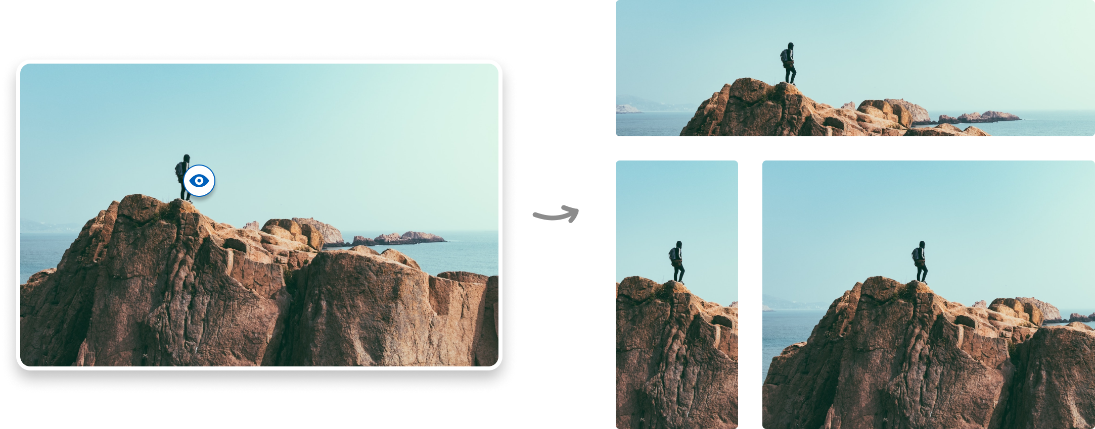
As responsive grid layouts are mostly done with image masks and background images, right positioning can be a pain in the a$$. FOCAL POINT is the #1 Wordpress Plugin for responsive cropping. Set a focal point on your images to ensure that the key part of an image won't get cropped.

Just set the focal point and the plugin does all the rest. The image be cropped to look good one every screen size.

Do you use different images for desktop and mobile? With PRO you can set separate focal points for each image.

You don‘t have to write a single line of code to use Focal Point. Just install it and it works out of the box in your Media page.
Get the #1 Wordpress Plugin for responsive cropping to make your images look great on every screen. Use separate mobile images with PRO.
Get the #1 Wordpress Plugin for responsive cropping to make your images look great on every screen. Use separate mobile images with PRO.


Just set the focal point and the plugin does all the rest. The image be cropped to look good one every screen size.

Do you use different images for desktop and mobile? With PRO you can set separate focal points for each image.

You don‘t have to write a single line of code to use Focal Point. Just install it and it works out of the box in your Media page.